Easy Ease Integration in Motion Graphics
Disney's Animation Department developed certain principles that they would incorporate to make their characters look not only natural, but larger-than-life. Today these principles are not only the foundation of Disney and Pixar's films, but of motion graphics as well. Here is a list of all the principles of animation. But for this post, I am only going to focus on one thing, and that is the concept of "Slow in, Slow out." Some might be more familiar with the term "easy-ease." Everything in nature, whether it is a car accelerating, a person or animal running, an object falling, or even a bullet that is fired, starts off slow, and if its not acted on by an outside force, i.e. something hitting the ground at high speed, it will decelerate and ease into a stop. So, graphics that are moving on screen need to follow that natural progression. When you do this, the motion of the animation looks smoother and more natural. Here is what I mean. Take a look at the video below. This is a circle in motion going from point A to point B with no easing at all.
Notice how unnatural it looks. It starts and stops too harshly.
To make these two keyframes have an ease in-and-out look, right click on the first keyframe and select easy-ease in, and on the last keyframe select easy-ease out. Now look at what it looks like with easy-ease enabled.
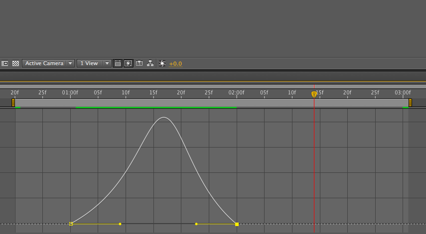
It looks a lot better, but I personally would not stop here. You can exaggerate this motion even more. (If you read all of the principles of animation, you would know that one of them is exaggeration.) From here we can go into the graph editor and change the wave of the keyframes to ease in and out a bit slower and make the motion in the middle be faster and more fluid. Here is what the graph editor looks like and how it makes the video look.
That looks a ton better! Now we can just click on the motion blur icon on both the layer and the comp, and it adds just a little touch of naturalism. Here it is:
A good example of this technique is used in the Covenant bumper for one of our series. The series was about broken relationships and how some things weren't meant to be broken. The idea of the video was to have text breaking apart the words that represented some of the broken things in our society. I knew this concept of easing in and out of the motion would become important. I wanted to produce a smooth motion of the breaking, but not sacrifice the readability of the words or lines of text.
I hope that this helped. Happy Editing!

